

PROJECT: Highmark Digital Insurance Form Experience
DURATION: 3 Months
ROLE: UX Designer
Project Background
During the transition to the redesigned health insurance member portal, we adapted the coordination of the benefits paper form to the digital space, improving the filling process, and streamlining the experience for our members.
When members fill out this form, the insurer can coordinate cost-sharing responsibilities with other insurance policies they may have, ultimately leading to better overall financial outcomes for members after they receive care.
Problem Statement
How might we design a Coordination of Benefits (COB) form that is intuitive, simple, and accommodating to our member’s needs, so that members are less likely to abandon the flow and the insurer can process members' claims accurately and promptly when members with multiple policies receive care?
Understanding User Scenarios
We collaborated with subject matter experts (SMEs) to identify various user scenarios and understand who needs to complete the form, why it is needed, and when, ensuring that member claims are processed accurately.
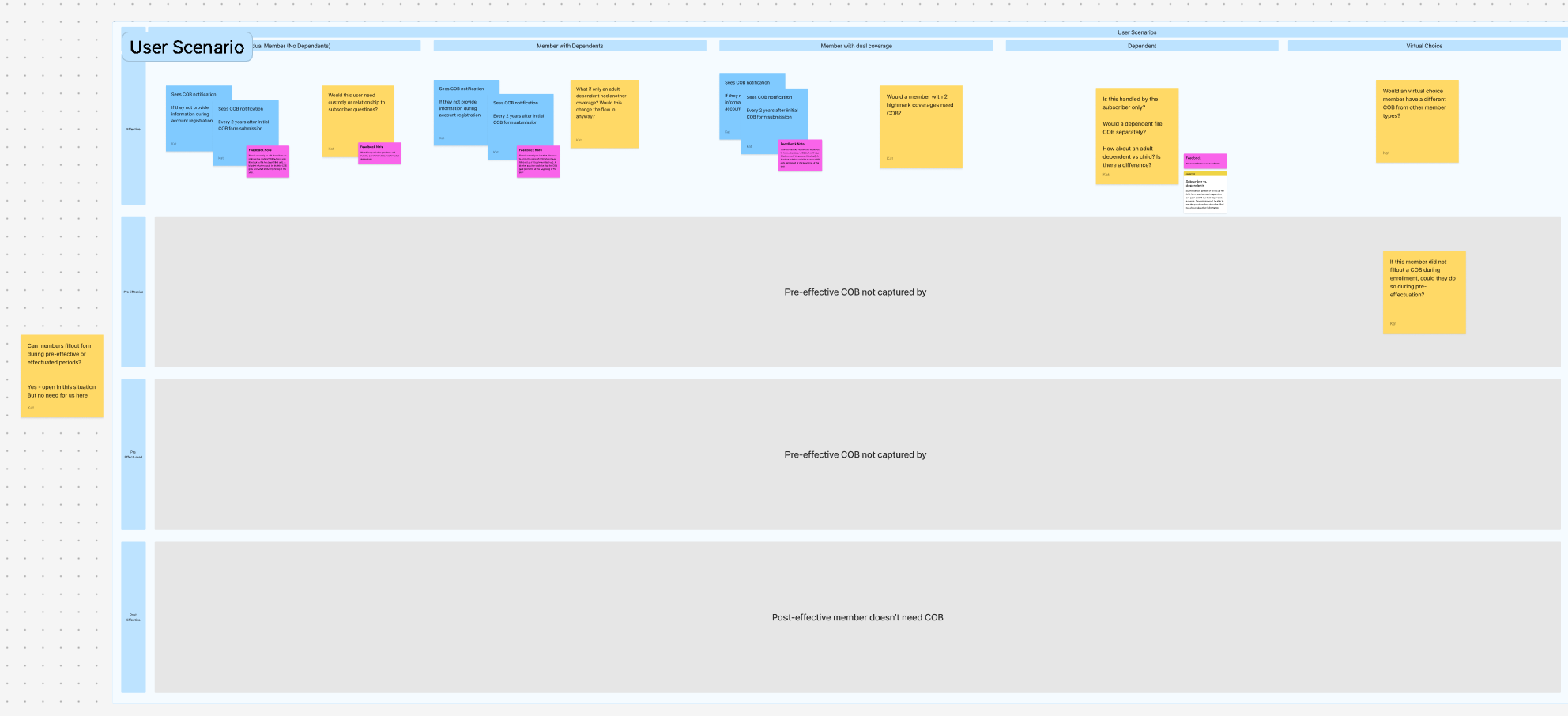
Grasping the User Flow
We needed to understand how the form functions and identify all the key points to ensure that what the member sees is tailored to their specific situation.
To achieve this, we collaborated closely with SMEs to create a flow diagram. This diagram mapped out all the instances where the form presented a decision point, helping us determine when and which fields should be shown to the member.
Ideation
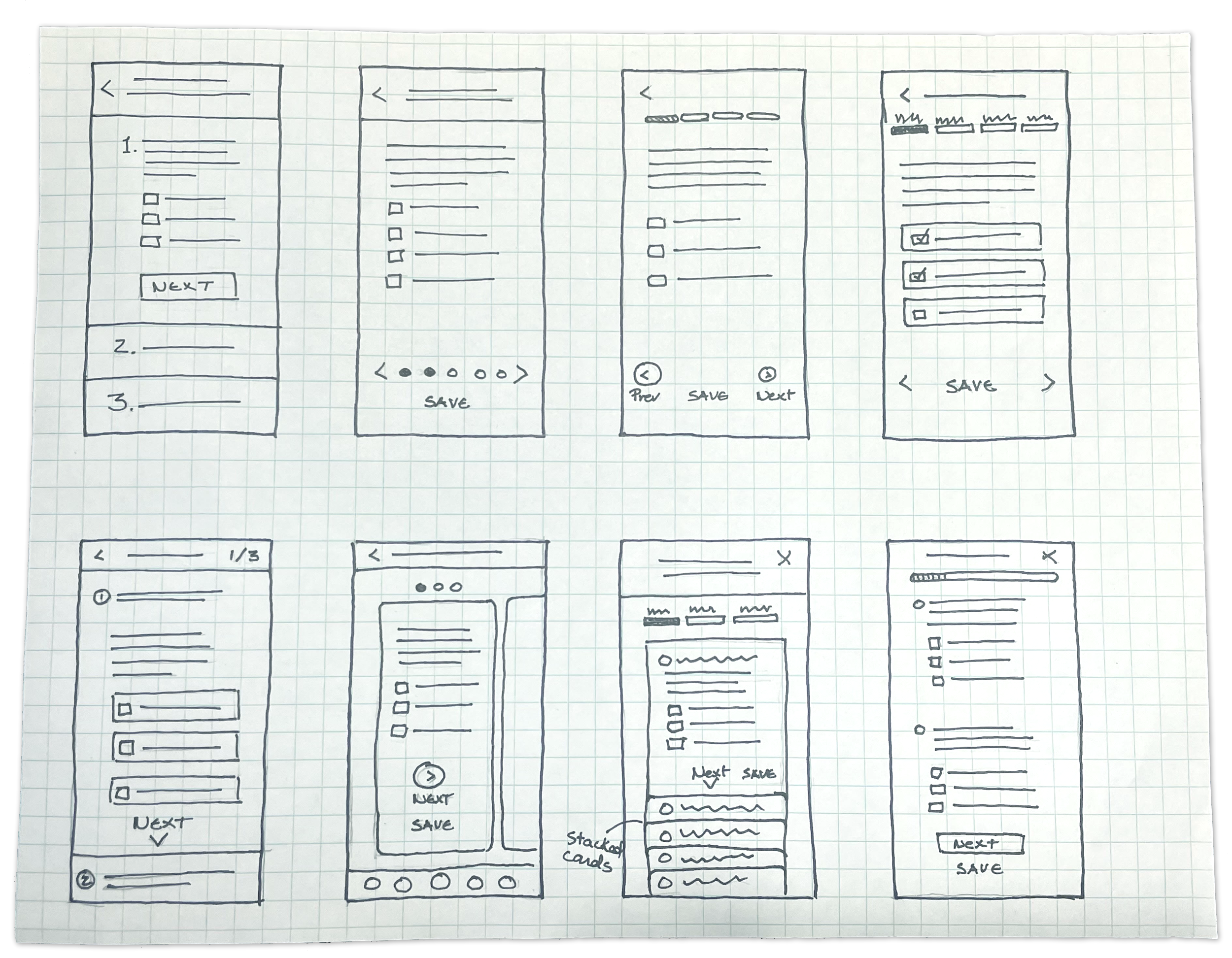
Sketching Ideas
The Crazy Eights ideation method quickly explored potential solutions, enhancing creativity and identifying user-friendly ways to present the form. This ensured users could easily understand their progress and feel at ease while completing it.
Exploring Solutions
We began exploring potential solutions by creating detailed wireframing mockups. These initial designs allowed us to visualize our ideas and lay the groundwork for the features and functionalities we aimed to develop.
Visualizing Our Approach
We created two prototypes to collaborate with stakeholders and refine various user flows based on different user scenarios.
Validating the Solution
Our UX Researcher conducted a usability test with refined prototypes to:
Assess if members can find and understand the form, and if they consider abandoning the task.
Evaluate if we provide enough upfront information to complete the form.
Check if members understand the questions and if more clarity is needed.
Identify pain points that need to be addressed before finalizing the designs.
Overall, participants reported that answering the questions was “straightforward” and “easy.”
Top pain points identified:
Users struggled to find the form.
Adding more information for each question could provide better support.
Clarifying the terminology used may enhance user responses.
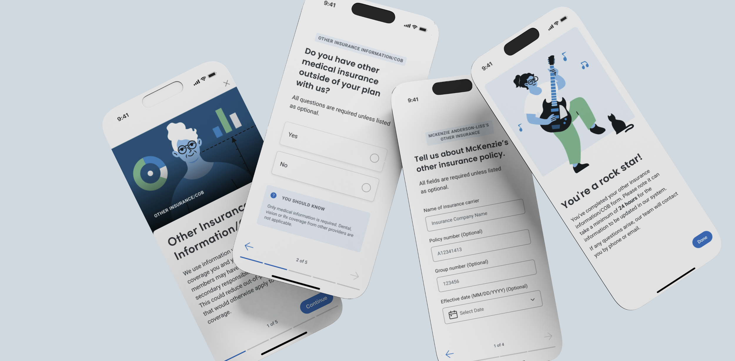
The Refined Solution
We revised the design to ensure easier way-finding, providing added support and clarity in the questions.
We also created divisions for members and their dependents. We enhanced the starting screen to provide members with the required information and estimated completion times.
Lessons Learned and Challenges
In this project, we learned how important it is to work with SMEs using prototypes and visuals instead of flow diagrams. This method helped us better identify key points in the user flow.
We faced some backend challenges. The first version of the form did not have user-friendly features, such as saving progress or clear instructions with time estimates for different scenarios. These issues made development difficult and led us to remove some dynamic features to ensure faster delivery. I hope we can add these improvements later to give users better time estimates and more freedom when filling out the form.