

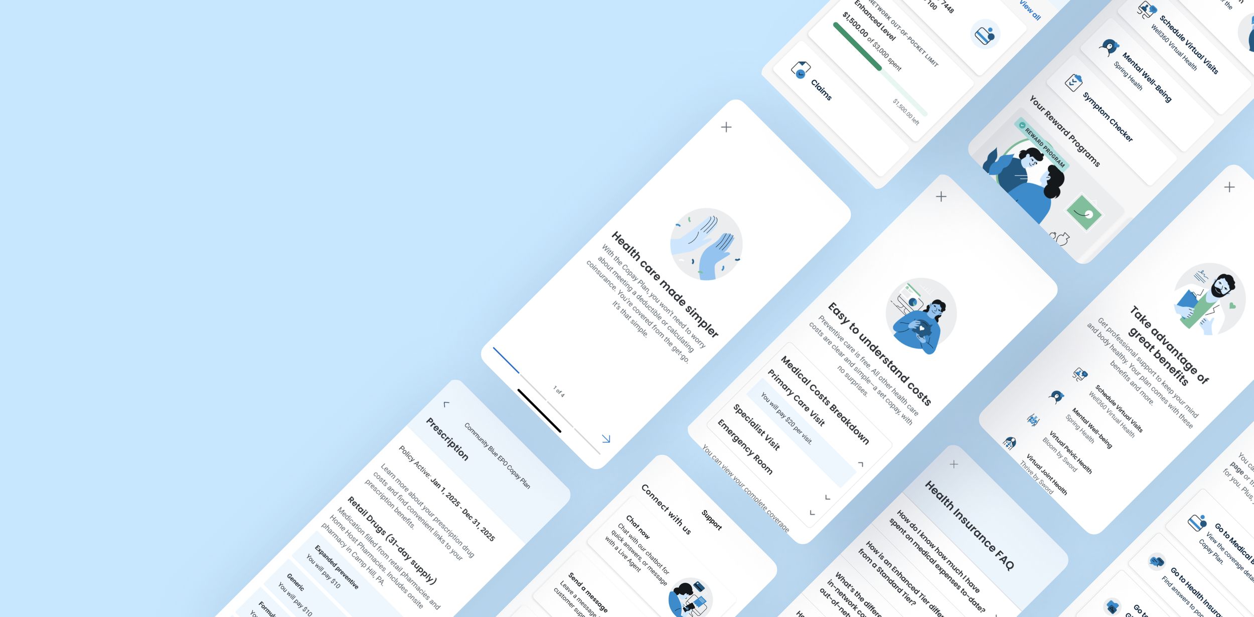
PROJECT: Highmark Copay Plan Experience
DURATION: 3 Weeks
ROLE: UX Designer
RESPONSIBILITIES: UX Strategy, Interaction Design, Visual Design, Design Workshops, Prototyping, Developer Collaboration, Design Handoff
Project Overview
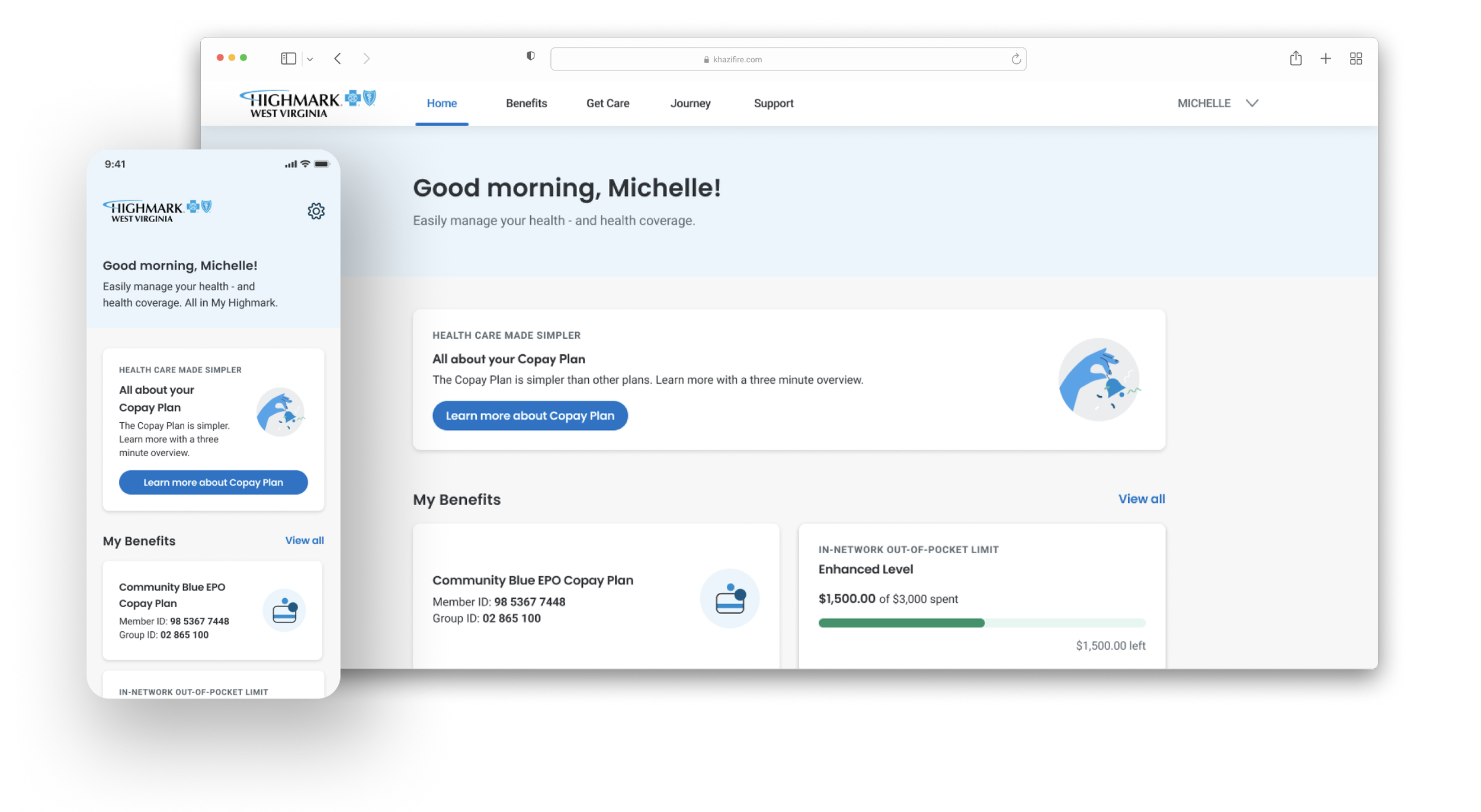
Health insurance can be confusing, with terms like deductibles and coinsurance making it hard for members to understand their costs. To tackle this, our insurance products team created Copay Plan, a copay-only insurance option that simplifies payments with fixed copays.
However, members needed a digital experience to clearly explain how the plan works and to help them navigate their benefits. The design team was given three weeks to create this experience, aiming for a pilot launch on January 1, 2025. Our team focused on designing this program and laying the groundwork for future improvements.
Understanding the Problem
We synthesized insights from previous Benefits & Coverage studies, usability sessions, customer support trends, and existing member feedback. Several themes consistently surfaced.
What we learned:
Members struggled to understand healthcare costs before receiving care.
Insurance terminology such as deductibles and coinsurance created unnecessary confusion.
Members had difficulty understanding the differences between the Enhanced and Standard plan tiers.
Finding providers and understanding available services required too much effort.
Members lacked a simple way to track their healthcare spending throughout the year.
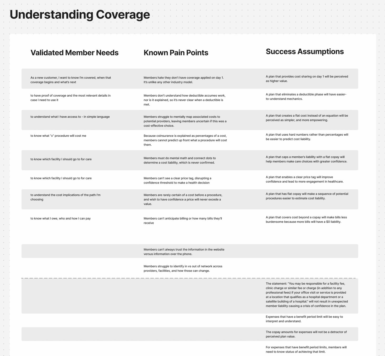
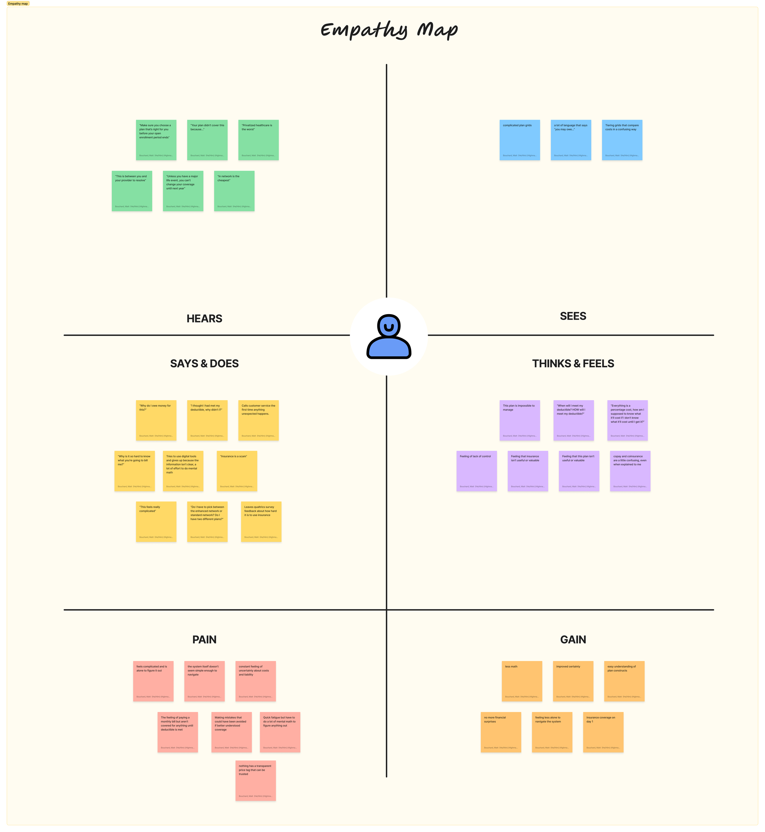
These insights helped us focus less on adding new functionality and more on simplifying information at the moments members needed it most.
Defining the Opportunity
We conducted a collaborative workshop that focused on key moments of the current experience. Participants included designers, product managers, engineers, researchers, and stakeholders. The goal was to challenge assumptions, examine competitor experiences, and identify opportunities.
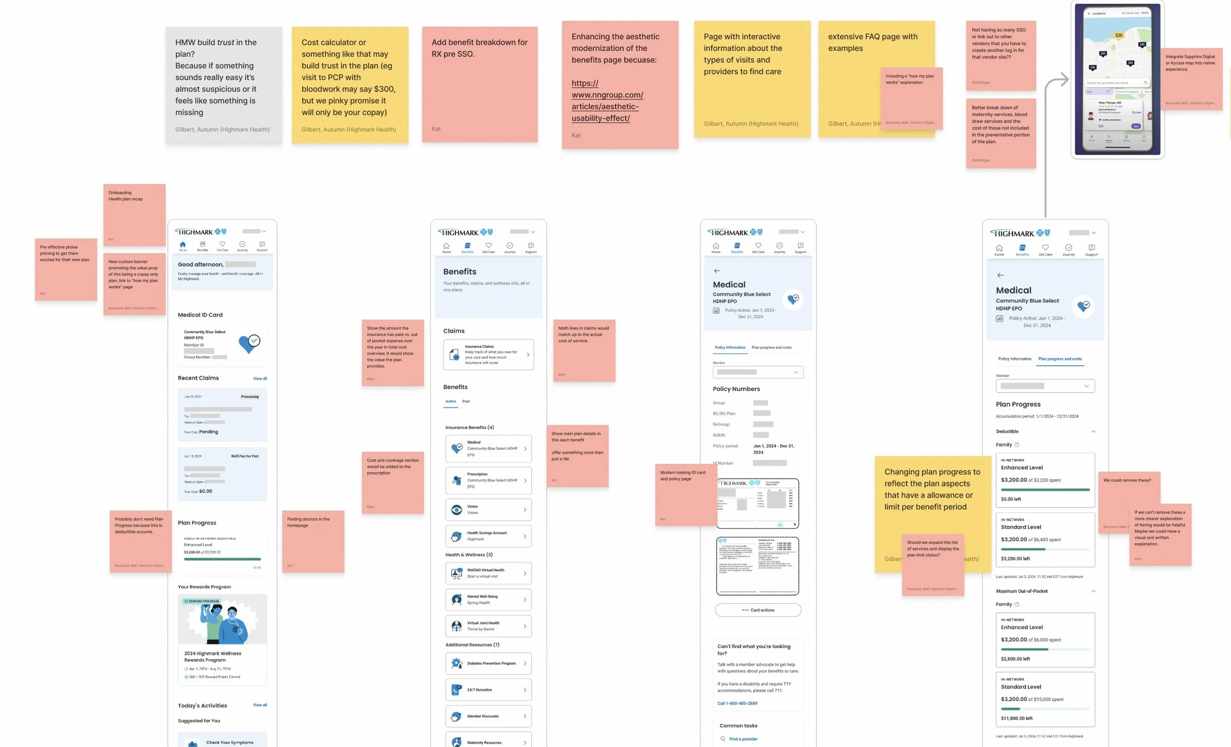
Priority moments identified:
Introducing members to their new plan
Finding doctors and healthcare services
Understanding service costs
Understanding pharmacy coverage
Tracking healthcare spending and plan limits
Learning common insurance concepts
Prioritizing the Right Solutions
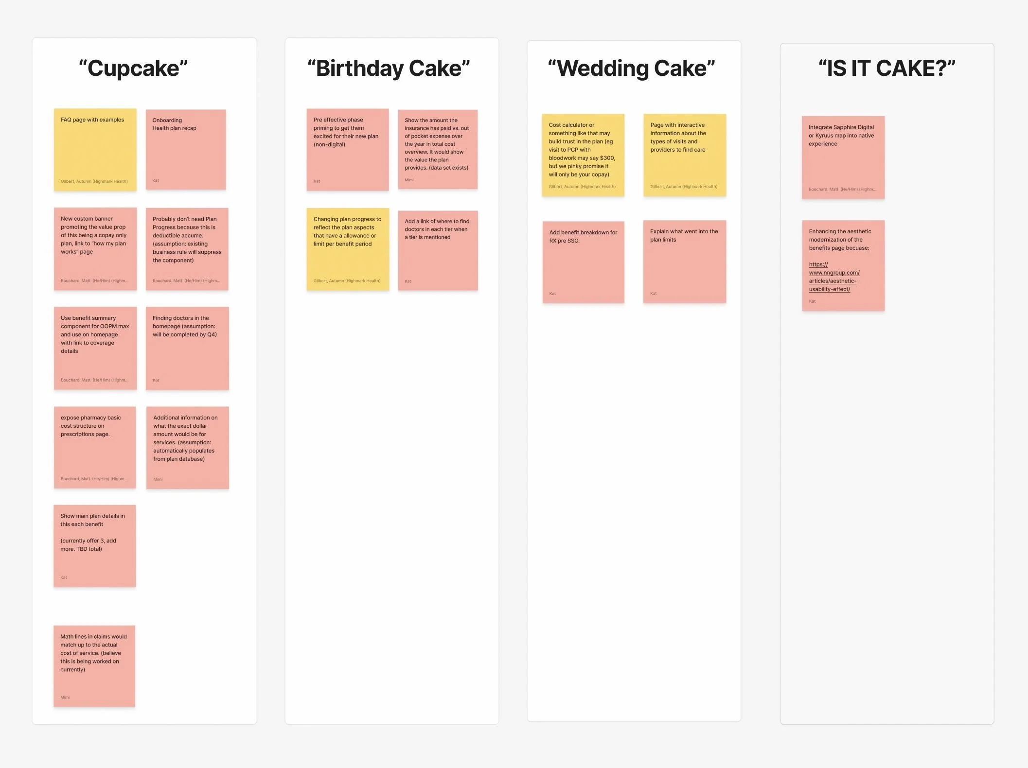
Our workshop generated more ideas than we could deliver in three weeks, so we needed a quick way to prioritize.
We organized each idea using a cupcake, cake, and wedding cake scale based on engineering effort and delivery risk. This helped us identify quick wins, larger opportunities, and ideas better suited for future phases.
We focused the MVP on the solutions that offered the most member value while remaining realistic for the launch timeline.
Ideation
Exploring Ideas
Each designer explored multiple concepts for the priority moments in the member journey. During collaborative critiques, we compared ideas against research insights, existing design patterns, and technical constraints.
Refining Concepts
Our goal wasn't to reinvent the experience—it was to reduce complexity.
As concepts matured, we partnered closely with engineering to validate feasibility, uncover dependencies early, and continuously refine the designs while development was already underway.
We also collaborated with our UX Content Writer to simplify insurance terminology into language members could understand without sacrificing accuracy.
Designing Under Pressure
Working on the Copay Plan required us to balance user needs with a tight delivery schedule. As development was already in progress while the designs were still evolving, our team collaborated closely with engineers throughout the implementation process, making continuous adjustments to maintain the intended user experience.
We faced several challenges beyond our control. Content creation was delayed due to staffing constraints, and some planned enhancements—such as expanded service coverage and pharmacy improvements—were reliant on external teams and data that would not be available before the launch.
Rather than delaying the release, we prioritized the most valuable experiences for our members and documented future enhancements for later phases.
The solution
We designed a streamlined experience that helps members understand and navigate their new Copay Plan with less uncertainty. The updated journey introduces the plan, makes healthcare spending easier to track, surfaces Find a Doctor when members need care, and provides clear copay costs for common services. We also added tailored FAQs and pharmacy coverage information so members could find answers and understand their costs without having to navigate multiple parts of the platform.
Measuring Success
Because of our accelerated timeline, formal usability testing wasn't possible before launch. Instead, we measured success through member engagement and onboarding completion after release.
The results demonstrated strong adoption of the new experience.
21.3%
Of Copay Plan members engaged with the Copay Plan Welcome experience.
93%
Of members who started the Copay Plan Welcome experience continued beyond the first page.
72.5%
Of members completed the entire Copay Plan Welcome experience flow.
Educational resources, including Medical Benefits and the final confirmation step, received the highest engagement, validating our decision to prioritize member education at various points in the user’s journey. These early metrics suggested that members were willing to engage with educational content when it was presented in a clear, guided experience.
These early metrics suggested that members were willing to engage with educational content when it was presented in a clear, guided experience.
What's Next
The pilot launch established a strong foundation for future iterations.
Future enhancements included:
Integrating service cost estimates directly into provider search.
Expanding the list of covered services as additional data became available.
Continuing to simplify insurance terminology across the experience.
Personalizing educational content based on member behavior.
Conducting usability testing to validate assumptions and uncover new opportunities.
Reflection
Copay Plan reinforced that successful product design isn't always about introducing new features—it's about reducing complexity.
With only three weeks to deliver, our team had to make thoughtful trade-offs, prioritize relentlessly, and collaborate closely with engineering throughout implementation. Rather than striving for a perfect solution, we focused on solving the problems that mattered most to members.
Looking back, the biggest lesson wasn't how quickly we shipped. It was that simplifying complex healthcare information can have a meaningful impact on members' confidence and understanding. By meeting people where they were and communicating in plain language, we created an experience that supported both the successful launch of a new insurance product and a stronger foundation for future improvements.